BT Question P1-T2-20-20-3: Regression diagnostic plots
BT Question 20.20.3
20.20.3. Patrick generated a simple regression line for a sample of 50 pairwise observations. After generating the regression model, he ran R’s built-in plot(model) function which produces a standard set of regression diagnostics. These four plots are displayed below.
library(tidyverse)## -- Attaching packages --------------------------------------------------------------------------------- tidyverse 1.3.0 --## v ggplot2 3.3.2 v purrr 0.3.4
## v tibble 3.0.3 v dplyr 1.0.2
## v tidyr 1.1.2 v stringr 1.4.0
## v readr 1.3.1 v forcats 0.5.0## -- Conflicts ------------------------------------------------------------------------------------ tidyverse_conflicts() --
## x dplyr::filter() masks stats::filter()
## x dplyr::lag() masks stats::lag()library(broom)
library(gt)
library(ggrepel)
intercept <- 4
intercept_sig <- 1
x1_mu <- 5
x1_sig <- 1
x1_beta <- 0.3
noise_mu <- 0
noise_sig <- 5 # low value gets low p-value b/c low noise
size <- 50
set.seed(25)
rho_noise_x1 <- 0.7
x1_start = 0
x1_end = 5
x1_step = (x1_end - x1_start)/size
results <- tibble(
x0_sn = rnorm(size),
x1_sn = rnorm(size),
x2_sn = rnorm(size), # needed to retain to preserve simulation results!
e = rnorm(size),
#
x0 = intercept + x0_sn * intercept_sig,
x1 = seq(x1_start, x1_end - x1_step, by = x1_step),
e_sigma = rpois(size,2),
x1_b = rep(x1_beta, size),
)
results1 <- results %>% mutate(
y = x0 + (x1_b * x1) + (e * e_sigma)
)
model_1 <- lm(y ~ x1, data = results1)
summary(model_1)##
## Call:
## lm(formula = y ~ x1, data = results1)
##
## Residuals:
## Min 1Q Median 3Q Max
## -8.2138 -1.7154 -0.6175 0.8984 11.1858
##
## Coefficients:
## Estimate Std. Error t value Pr(>|t|)
## (Intercept) 3.9116 0.9257 4.225 0.000106 ***
## x1 0.4636 0.3256 1.424 0.160933
## ---
## Signif. codes: 0 '***' 0.001 '**' 0.01 '*' 0.05 '.' 0.1 ' ' 1
##
## Residual standard error: 3.322 on 48 degrees of freedom
## Multiple R-squared: 0.04053, Adjusted R-squared: 0.02054
## F-statistic: 2.028 on 1 and 48 DF, p-value: 0.1609# model_tidy_1 <- tidy(model_1)
# model_tidy_1[2,1] <- "Factor"
# plot(model_1)
# autoplot(model_1) # +
# geom_text(vjust=-1, label=rownames(results1))
# mean(results1$y) # price
# mean(results1$x0) # intercept
# mean(results1$x1) # sqfeet
par(mfrow = c(2,2))
plot(model_1, id.n = 0) 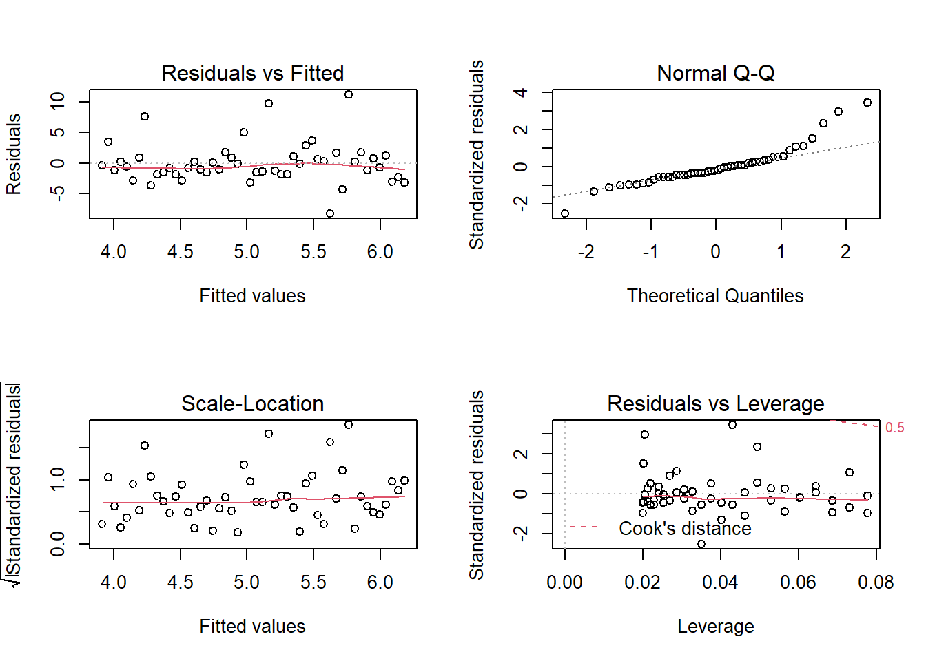
# id.n: number of points to be labelled in each plot, starting with the most extreme.

model_1
##
## Call:
## lm(formula = y ~ x1, data = results1)
##
## Coefficients:
## (Intercept) x1
## 3.9116 0.4636What do the plot() diagnostics tell us?
Residuals vs Fitted
This plots residuals against the fitted values. We would like to see the residuals randomly scattered across the zero (which these are). The scatter pattern is relatively even suggesting homoskedasticity; i.e., we do not see a pattern that suggests heteroskedasticity. There are not many outliers. This is pretty good-looking residuals vs fitted plot suggestive of a decent linear regression.
Normal Q-Q
If the distribution is normal, the plot will approximate along the straight line. But notice how this plot contains an obvious heavy-tail on the right side.
Scale-location
This plot is similiar to the Residuals vs Fitted plot, but the residuals are standardized. It is also used to evaluate heteroskedasticity. But, again, we do not perceive strong evidence of a non-constant variance.
Residuals vs Leverage
The red dashed line represents a Cook’s distance of 0.5, but there are not observations outside of this line (i.e., in the upper-left) such that we do not have a case for outlier(s).